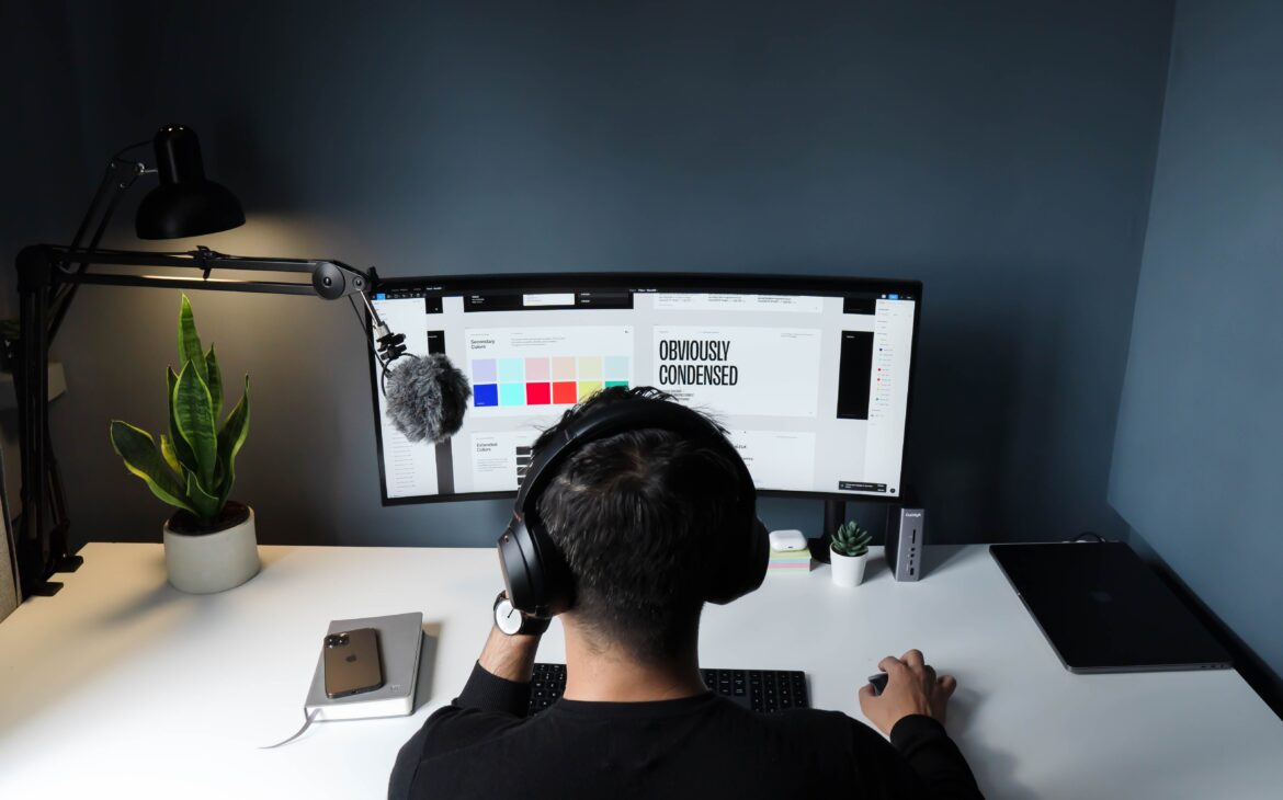
Add contrast In Graphic Design.
This entails deciding what you want the spectator to look at initially. The eye is drawn to a specific area by contrast. In technical terms, it’s the discernible variation in the characteristics of the design parts. The idea viewers are most familiar with is color, a fundamental component of graphic design. You see images and like those images with their color contrast because some images and posters we see and don’t like are also not eye-catching; somewhere, we know that color contrast plays a vital role in every field. Without color contrast, everything is incomplete, but with colors, everything is complete.
By incorporating contrast, you can make your design more dynamic and engaging. For example, pairing a bold headline with a simple sans-serif font for body text can create a strong visual impact. Playing with light and dark values can add depth and dimension to your designs. Overall, adding contrast in graphic design creates visually appealing compositions that capture attention and convey information effectively.
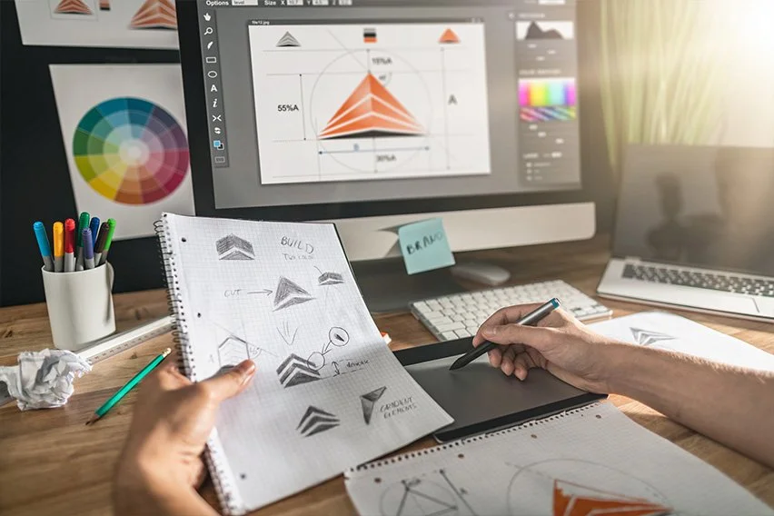
Use one font In Graphic Design
For graphic design, choosing and coordinating fonts are two distinct art forms and expertise. The typeface or fonts should be readable and appropriate for the message’s tone and mood. Your graphic design job will be far more valuable if you become an expert at combining and choosing fonts. We also know that because everyone uses fonts everywhere, we experience and love them; every graphic designer must know about fonts, like which font will be suitable and attractive, which people will like and love your fonts because fonts also attract people like we saw the big brands uses stylish and beautiful fonts for their brand name and for their everything that feels awesome to their self and also for their customers.
Here are some famous fonts that people use most.
- Helvetica
- Arial
- Futura
- Garamond
- Roboto
- Calibri
- Garamond
- Times New Roman
Fonts and typography In Graphic Design
Typography organizes text and letters so the reader can easily read, understand, and find the content visually pleasing. It includes typeface appearance, style, and structure, all intended to communicate particular messages and evoke specific feelings. To put it briefly, typography is what gives the writing life. It all depends on you, like how attractive and impressive you can create your work, and if you want to impress your client, then you make fantastic because when we show our work to others, we always want to impress and get appreciation from them. Use fonts and typography in Graphic Design. Using beautiful fonts that will blow people’s minds is a skill every graphic designer should know.
Furthermore, comprehension of hierarchy, kerning, leading, and tracking—important typographic components that impact readability and overall aesthetics—is essential. Trying various font combinations might produce original and imaginative designs that draw the eye and communicate your intended message. Essentially, typefaces are more than letters on a page—vital instruments that can elevate or detract from a design.

Handwritten styles
The style of handwriting is precisely that—handwritten. It can be written in block capitals, cursive, drawing, marker, chalk, and other styles. A handwriting-style font can generate genuinely original company signatures and logos. Even your handwriting may be there—now that would be a unique touch.
Handwritten elements are perfect for projects that need a more personal touch, like wedding invitations or greeting cards, because they may generate a sense of closeness and authenticity. Additionally, handwriting styles can assist in portraying particular feelings or moods. Bold block letters can provide a sense of power and strength while flowing cursive script might be employed for a romantic design. Ultimately, there are countless options and creative chances when combining handwriting with graphic design.
Minimalist typography
In graphic design, minimalism promotes constraint and focus in everything from font to layout, enabling the viewer to interact with the message or material without distraction. It involves making thoughtful, occasionally bold decisions to effectively and efficiently communicate information or arouse emotion. Minimalist typography can convey a message effectively and make a strong visual impact.
This style often relies on contrast between bold headlines, delicate body text, and strategic text placement within the layout. Minimalist typography is popular in branding, editorial, and web design because it exudes sophistication while remaining easily read. Overall, it’s a timeless approach that can elevate any design project with its refined aesthetic.

Conclusion
In Conclusion, we know all the information we have written in our blog; the first one is to Add color contrast, which is crucial for their design in graphic design. We cannot expect a beautiful design without good color contrast, so we should use a nice color contrast that will blow people’s minds. The second one is to use one font because a font works in beautiful ways. Fonts and typography text and letters are arranged according to typography so the reader can read, comprehend, and find the information visually appealing.
It consists of typographic appearance, style, and structure, all meant to convey specific ideas and arouse particular emotions. Handwritten styles The style of handwriting is precisely that—handwritten. It can be written in block capitals, cursive, drawing, marker, chalk, and other styles. A handwriting-style font can generate genuinely original company signatures and logos. Even your handwriting may be there—now that would be a unique touch. The last one is Minimalist typography. Minimalist typography in graphic design encourages restraint and concentration in everything from font choice to layout, enabling interaction between the audience and the content or message without being sidetracked. So, use it creatively and thoughtfully to elevate your work.
FAQS
Q 1: When is typography most appropriate?
Ans: In conclusion, because serif typefaces lend a conventional style and readability to printed materials, typography is usually best suited for print visuals. The efficient communication of information and visual appeal depends heavily on document design and typographic selection principles.
Q 2: Where is the typography used?
Ans: There is typography everywhere we turn. It can be found in books we read, websites we visit, and even in commonplace items like bumper stickers, product packaging, and street signs. However, what precisely is typography? To put it simply, typography is the appearance or style of text.
Q 3: What aspect of the designs’ use of typography works well?
Ans: In graphic design, typography serves two primary functions. The first is to make a design piece more readable, and the second is to aid in conveying the design’s message, tone, and emotion. Typography also plays a role in aesthetics. Clear, aesthetically pleasing designs that are easy on the eyes lure us in.
Get up to 70% Discount on Amazon (Buy Now)
Buy Web Hosting at an affordable price: Buy Now
If you want to build your website at an affordable price, contact www.nextr.in
Read this: How To Become A Web Developer?

