The Biggest Graphic Design Trends For Designer
Graphic design is an ever-evolving field, with trends and techniques constantly changing. Staying up-to-date with the latest design trends is crucial for designers to create visually appealing and impactful work. In this article, we will explore the biggest graphic design trends that are shaping the industry today. From minimalist design to bold typography, 3D graphics to dark mode, sustainability to custom illustrations, and retro and vintage aesthetics, we will delve into each trend, providing insights and guidance on how to incorporate them into your design projects. Whether you are a seasoned designer or just starting your design journey, this article will inspire and equip you to create cutting-edge designs that captivate and engage your audience.
1. Minimalist Design: Embracing Simplicity
The Rise of Minimalism
In a cluttered and overwhelming digital landscape, minimalist design offers a breath of fresh air. It strips away unnecessary elements, focusing on what truly matters. From websites to logos, minimalism creates a clean and modern aesthetic that resonates with users.
Less is More: Key Elements of Minimalist Design
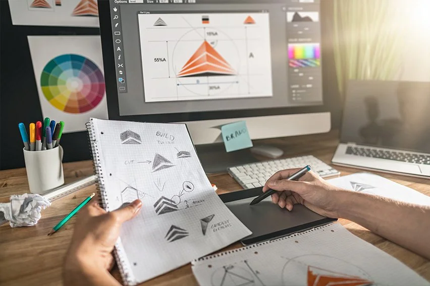
Designers carefully choose only the essential elements to include, eliminating any excess. This streamlined approach creates a sense of clarity and purpose. Simple geometric shapes, clean lines, and ample white space are often used to achieve this minimalist aesthetic.
White Space: Creating Balance and Focus
White space, also known as negative space, is a crucial component of minimalist design. It provides breathing room for the elements on a page, enhancing legibility and overall visual appeal. It allows the eye to rest and helps create a sense of balance and focus. Using white space effectively can greatly impact the user experience, making the content more digestible and engaging.
2. Bold Typography: Making a Statement
The Power of Typography
Typography has always played a significant role in design, but now it’s taking center stage. Bold, eye-catching typography is being used to make a statement and grab the viewer’s attention. Whether it’s on a website, poster, or packaging, typography sets the tone and conveys the brand’s personality.
Experimenting with Font Sizes and Styles
Designers are embracing the freedom to experiment with font sizes and styles. Oversized headlines demand attention, while unique typefaces add personality and distinction. Mixing different font styles within a design can create visual interest and hierarchy. The key is finding the right balance between legibility and artistic expression.
Contrasting Colors: Enhancing Typography
To further enhance the impact of typography, designers are using contrasting colors. Bold and vibrant hues create a visual punch, making the text stand out. Contrast also improves readability, ensuring that the message is clear and easily understood. Combining complimentary colors or using a dark font against a light background can create a striking visual effect.
3. 3D Design: Adding Depth and Dimension
The Popularity of 3D Design
Three-dimensional design has surged in popularity due to its ability to add depth and dimension to digital experiences. Previously limited to the realm of gaming and animation, 3D elements are now being integrated into various design projects. From product visuals to website interfaces, 3D design brings a level of realism and interactivity that captivates users.
Creating Realism through Shading and Lighting
To achieve a realistic 3D effect, designers focus on shading and lighting techniques. Simulating natural light sources and shadows adds depth and dimension to objects, making them appear more tangible. Carefully crafted textures and gradients further enhance the overall visual experience, creating a sense of realism and immersion.
Combining 2D and 3D Elements
Designers are blending the best of both worlds by combining 2D and 3D elements in their compositions. This hybrid approach adds visual interest and allows for greater creativity. By integrating 3D objects seamlessly into 2D designs, designers can create captivating visuals that leave a lasting impression on viewers.
4. Dark Mode: Embracing the Dark Side
The Growing Trend of Dark Mode
Dark mode has become popular across various devices. With its sleek and contemporary appeal, dark mode offers a refreshing alternative to the traditional bright backgrounds. It not only reduces eye strain but also adds a touch of sophistication to the overall design.
Designing for Dark Mode: Tips and Tricks
Designing for dark mode requires thoughtful consideration of color schemes and contrast. Opt for lighter colored text or elements to ensure readability against the dark background. Utilize vibrant colors to create visual interest and prevent the design from feeling flat. Dark mode also presents an opportunity to experiment with unique color combinations that stand out in a sea of light themes.
Using Vibrant Colors in a Dark Background
Contrary to popular belief, dark mode doesn’t mean all colors need to be subdued. In fact, vibrant colors can shine even brighter against a dark background. Creating a striking contrast between bold hues and the dark canvas can make the design truly pop. This combination can evoke a sense of excitement and energy, while still maintaining the overall elegance of dark mode.
5. Sustainability: Designing with a Purpose
The Importance of Sustainable Design
In a world where environmental consciousness is increasingly important, sustainable design is more than just a trend – it’s a responsibility. As designers, we have the power to make a positive impact by incorporating sustainable practices into our work. From utilizing eco-friendly materials to reducing waste, sustainable design allows us to create with purpose and contribute to a greener future.
Using Eco-friendly Color Palettes
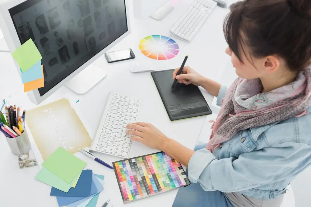
When it comes to incorporating sustainability into graphic design, color palettes play an important role. Opting for eco-friendly colors can mean using hues inspired by nature or even choosing colors that promote energy efficiency. By selecting colors that align with sustainability principles, we can communicate our environmental commitment visually.
Incorporating Sustainable Elements in Branding
Branding is an essential part of any business, and it’s also an opportunity to make a sustainable statement. Incorporating sustainable elements into branding, such as using recycled materials for packaging or designing digital assets that promote eco-friendly practices, allows businesses to showcase their commitment to the environment. With sustainability at the forefront, brands can connect with environmentally conscious consumers and inspire positive change.
6. Geometric Shapes: A Modern Twist
The Versatility of Geometric Shapes
Geometric shapes have long been favored by designers for their clean lines and modern aesthetic. They offer a versatility that can be applied to various design elements, from logos to illustrations to typography. Whether it’s the simplicity of a circle or the complexity of a hexagon, geometric shapes bring structure and visual interest to any design.
Creating Symmetry and Balance
One of the key characteristics of geometric shapes is their ability to create symmetry and balance. Their precise angles and proportional forms can help achieve visual harmony in a design. By leveraging the power of symmetry, designers can create a sense of order and professionalism that resonates with viewers.
Geometric Patterns and Backgrounds
Geometric patterns and backgrounds have become increasingly popular in graphic design. From intricate tessellations to bold, repetitive shapes, these patterns add depth and intrigue to designs. Whether used subtly or as the main focal point, geometric patterns and backgrounds can transform any design into a modern masterpiece.
7. Custom Illustrations: Adding Personality
The Appeal of Custom Illustrations
Stock images and generic icons are a thing of the past. Custom illustrations are now the go-to choice to add personality and uniqueness to a design. By creating custom illustrations, designers can tailor the visuals to match a brand’s tone and message. This personal touch not only sets a design apart but also creates a memorable and engaging experience for the audience.
Creating Unique Characters and Scenes
Custom illustrations allow designers to bring their imagination to life by creating unique characters and scenes. From whimsical illustrations that capture the essence of a brand’s story to bold and vibrant characters that command attention, the possibilities are endless. By using custom illustrations, designers can inject personality and emotion into their designs, making them more relatable and impactful.
Illustrations as a Branding Tool
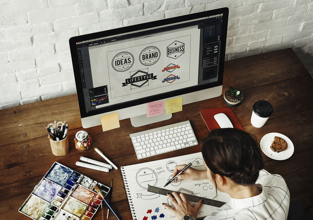
Illustrations have become an integral part of branding strategies. They can evocatively convey a brand’s identity and values, helping to establish a strong connection with customers. Custom illustrations can be used across various touchpoints, such as websites, social media, and promotional materials, ensuring consistency and enhancing brand recognition. By incorporating illustrations as a branding tool, designers can create a cohesive visual language that resonates with audiences.
8. Retro and Vintage: Nostalgia in Design
The Revival of Retro and Vintage Design
Everything old is new again, and retro and vintage design styles are no exception. Nostalgia has made a comeback in the design world, with designers embracing the aesthetic of bygone eras. From vintage-inspired typography to retro color palettes, these elements evoke a sense of nostalgia that connects with audiences on an emotional level.
Using Vintage-inspired Colors and Textures
Colors and textures play a vital role in capturing the essence of retro and vintage design. By using muted tones, faded hues, and subtle gradients, designers can recreate the nostalgic vibe of the past. Additionally, adding textures like worn paper or distressed effects can further enhance the vintage aesthetic, giving designs an authentic and aged feel.
Mixing Retro and Modern Elements
While retro and vintage design styles embrace the past, they can be combined with modern elements to create a fresh and contemporary look. By blending retro-inspired typography with sleek and minimalist layouts, designers can achieve a unique fusion of old and new. This juxtaposition generates visual interest and keeps designs from feeling outdated, appealing to a wide range of audiences.
As the graphic design landscape continues to evolve, it is essential for designers to stay informed about the latest trends. By embracing minimalist design, experimenting with bold typography, incorporating 3D elements, exploring dark mode, designing sustainably, utilizing geometric shapes, creating custom illustrations, and incorporating retro and vintage aesthetics, designers can elevate their work to new heights. By incorporating these trends strategically and thoughtfully, designers can create visually stunning and impactful designs that resonate with their target audience. So, keep exploring, experimenting, and pushing the boundaries of design to stay ahead of the curve in this exciting and ever-changing field.
Frequently Asked Questions
1. How do I incorporate minimalist design into my graphic design projects?
To incorporate minimalist design, focus on simplicity and decluttering your designs. Use clean lines, ample white space, and minimal color palettes. Remove any unnecessary elements and prioritize hierarchy to create a visually balanced and impactful design.
2. What are some key considerations when designing for dark mode?
When designing for dark mode, consider contrast, readability, and the use of vibrant colors. Ensure that text and elements are easily legible against dark backgrounds. Experiment with color palettes that enhance the overall visibility and appeal of your design in a dark mode setting.
3. How can I create custom illustrations that effectively represent my brand?
To create custom illustrations that represent your brand, start by understanding your brand identity and values. Then, develop a unique visual style that aligns with your brand. Incorporate elements that reflect your brand’s personality and story, ensuring that the illustrations are cohesive and consistent with your overall brand image.
4. How can I incorporate retro and vintage aesthetics without making my design look outdated?
To incorporate retro and vintage aesthetics while maintaining a modern look, consider using selective elements such as typography, colors, or textures that evoke a nostalgic feel. Combine these elements with contemporary design techniques and trends to create a harmonious balance between the old and the new.
Thank you for reading 🙂


